
What is allowed to happen?
Someone gives me a coordinate: −23.973037 / 25.854650. Kweneng District, Botswana, about 75 kilometres north of Gaborone. Along with it a hunch: that an area there was fenced off and turned green again afterwards.
I am not testing that hunch. I am looking at what is there, before I know what I want to see. Anyone who walks into data with an expectation usually finds it.
A fence is not a plant. It is a decision about what may happen on a piece of land and what may not: who enters it, who grazes there, who takes something away. Decisions like that cannot be seen from orbit. Their consequences perhaps can.
700 km Seeing
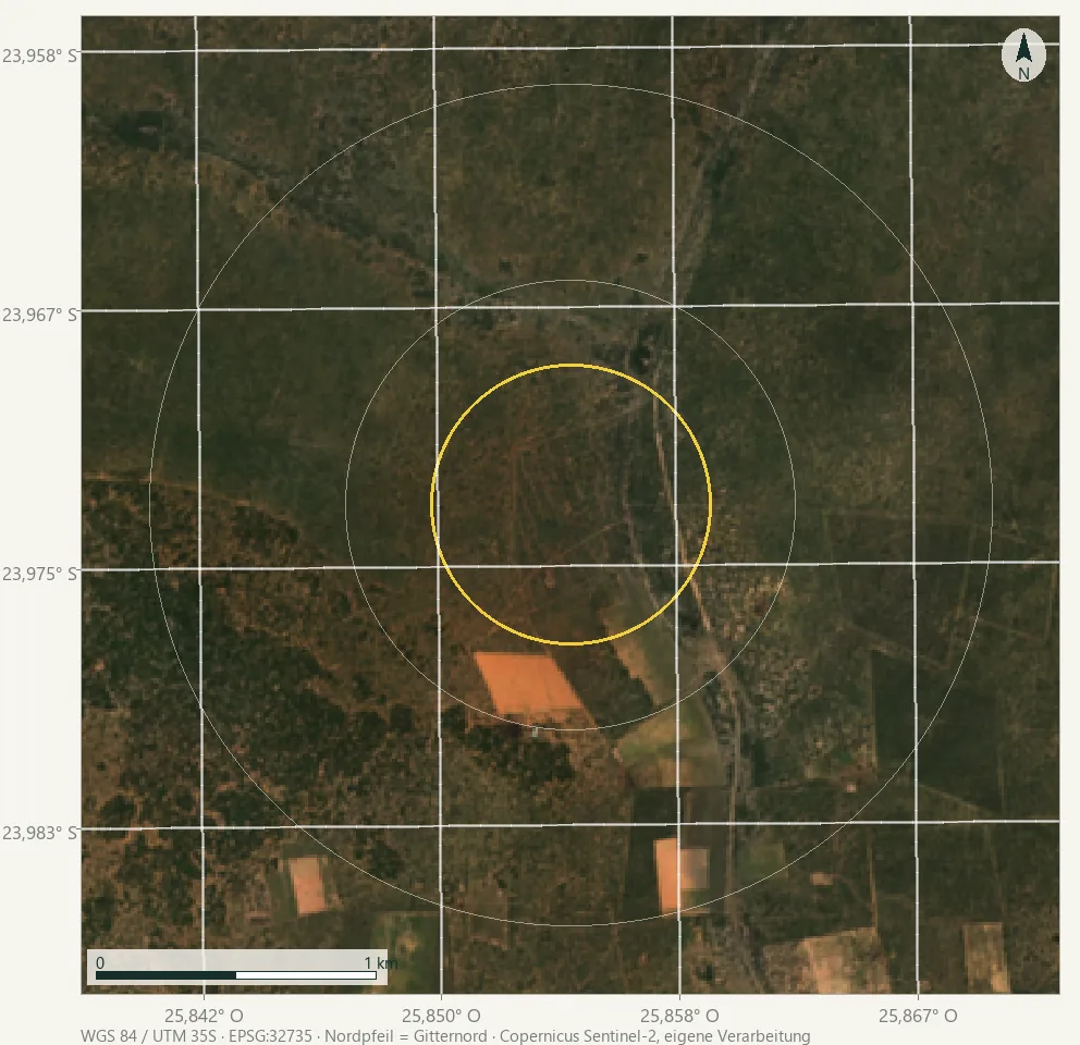
Bush savannah, in the centre a cleared area with paths running towards it from several sides. To the south geometric parcels, to the west denser growth. You cannot see a fence: a fence is a few centimetres wide, a pixel is ten metres.
Neither OpenStreetMap nor the geocoding service knows a named place here. That, too, is a finding. Anyone working over Germany has cadastral parcels, field blocks and soil maps. Here there is a satellite.
One year When anything grows here at all
Before I compare years, I need to know when to look. The green value in October and the one in January are not the same measurement here. They differ by several times whatever a year-on-year comparison could ever show. So first the annual curve, three cycles from July to June. A calendar year will not do: the rainy season crosses the turn of the year.
| Month | 2021/22 | 2023/24 | 2025/26 |
|---|---|---|---|
| Jul | 0.215 | 0.205 | 0.300 |
| Aug | 0.193 | 0.187 | 0.266 |
| Sep | 0.178 | 0.175 | 0.260 |
| Oct | 0.167 | 0.168 | 0.315 |
| Nov | 0.184 | 0.213 | 0.414 |
| Dec | 0.354 | 0.279 | 0.509 |
| Jan | 0.470 | 0.326 | 0.532 |
| Feb | 0.448 | 0.331 | 0.473 |
| Mar | 0.408 | 0.302 | 0.446 |
| Apr | 0.364 | 0.324 | 0.425 |
| May | 0.351 | 0.341 | 0.371 |
| Jun | 0.288 | 0.296 | 0.317 |
The peak is in January, the trough in September or October; between them lie 0.17 to 0.30 NDVI points, five to ten times the difference this instalment is about. 2023/24 breaks the pattern: a flat curve with half the amplitude and a shifted maximum in May. That is what a weak rainy season looks like.
This cost me a draft. My first window ran from 1 February to 15 April, textbook knowledge for southern Africa, not measured. It sat on the descending limb and, depending on the year, caught only 69 to 88 percent of the amplitude. A swing like that distorts systematically, not randomly. Every number below therefore rests on 15 December to 15 March.
20 m Exploring
The obvious analysis would be the wrong one. If I plot the green value of this area over ten years, what I mostly measure is the rain. So I do not compare the core with itself but with its surroundings: a ring from 800 to 1,500 metres. Both get the same rain, the same cloud cover, the same sensor. Whatever is left over belongs to the place.
Result: in nine out of ten rainy seasons the core is darker than its surroundings. On average by 0.031 NDVI points; only 2025 flips the sign (+0.009). If the two areas were in truth the same, chance would decide the direction every year. For it to pick the same direction nine times would then happen in about one case in fifty.
Each of these annual images is a median of 5 to 26 cloud-free observations per pixel, typically 18. In no year does a pixel have fewer than five. The numbers are in the methods section below.
That is a state, not a change. For the question of whether something is happening, comparing two averages is no use. It blurs exactly the case at issue: a sub-area recovering while the rest stays put.
Ten years What is changing
So the same calculation again, but per pixel and about change rather than state. For every pixel the ten annual values, minus the value of the surroundings; that removes the rainfall year. The balance is drawn over the 1,966 pixels of the core and the 12,642 of the control ring; the map shows the whole view, the numbers do not. Through the remaining ten values I fit a line, one that does not tip over when a single year is out of step. And then I ask, for every pixel, whether its direction is more than chance. Both are standard procedures for environmental time series; the names are in the sources below.
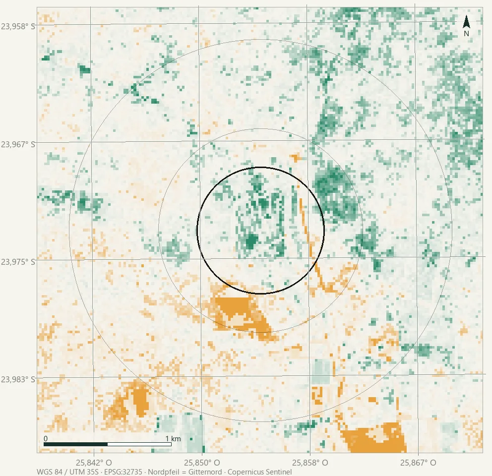
Change relative to the surroundings, per pixel and year
- Strong colour: the direction is supported by the data. Chance alone would show it this way in fewer than one case in twenty.
- Pale colour: a direction is there, but it cannot be supported. It stays visible: a map that shows only what is proven looks like more of a finding than the data allows.
- Full colour is the end of the colour scale, not of the data: values beyond ±0.02 per year all appear equally strong.
Now what the average hid becomes visible. Inside the core lies a connected patch that is gaining: 417 pixels with a supported increase against 90 with a decrease, more than four to one. In the control ring the same ratio is close to even: 1,112 to 762. The core rises by a median of 0.0034 NDVI points per year, the ring by 0.0005, so effectively not at all. A supported trend of any kind appears in 25.8 percent of the pixels in the core, and in 14.8 percent in the ring.
And the opposite direction sits right next to it: the tracks and the fields to the south run amber, so they are declining. Same map, same calculation.
A counter-check belongs here. If I average the core-minus-ring difference into a single number per year and fit a line through the ten values, it does rise, by 0.003 per year, but that does not count as supported (p ≈ 0.21). This is not a contradiction but a different question: the average asks whether the whole area is drifting; the map asks where individual patches are changing. A connected patch of a few hundred pixels can answer the second question clearly and still disappear in an average over nearly two thousand.
That leaves a second finding beside the first, and both hold at the same time. This area is poorer than its surroundings, and it is catching up. Over ten years the slope adds up to about three hundredths of an NDVI point, which is exactly the size of the gap to the surroundings. Arithmetically the deficit would be used up by now, which fits 2025, the one year with the opposite sign. But a line through ten points is not a timetable; it says nothing about whether things carry on this way.
One thing has to be justified here, because every number above rests on it: the ring. It lies between 800 and 1,500 metres and no closer, so that the core and its edges stay outside it; and no further, so that it still sees the same cloud, the same rain and the same viewing geometry as the core. It is not an untouched reference, but the same landscape without the one decision that was taken inside the core. That is exactly why the difference measures the decision and not the weather. If the ring itself had been cleared, the finding would vanish; the map shows that it has not been.
Two lenses Colour and water
Up to here everything measures the NDVI, that is, the colour. For a dry savannah that is the obvious lens, but not the only one. The NDMI uses the shortwave infrared and measures the water in the leaf itself. Here both come from the same acquisitions and the same cloud mask. A single request delivers both, because the Processing API bills input bands, not output ones. What separates the two maps is therefore a difference in the vegetation and not one in the sample.
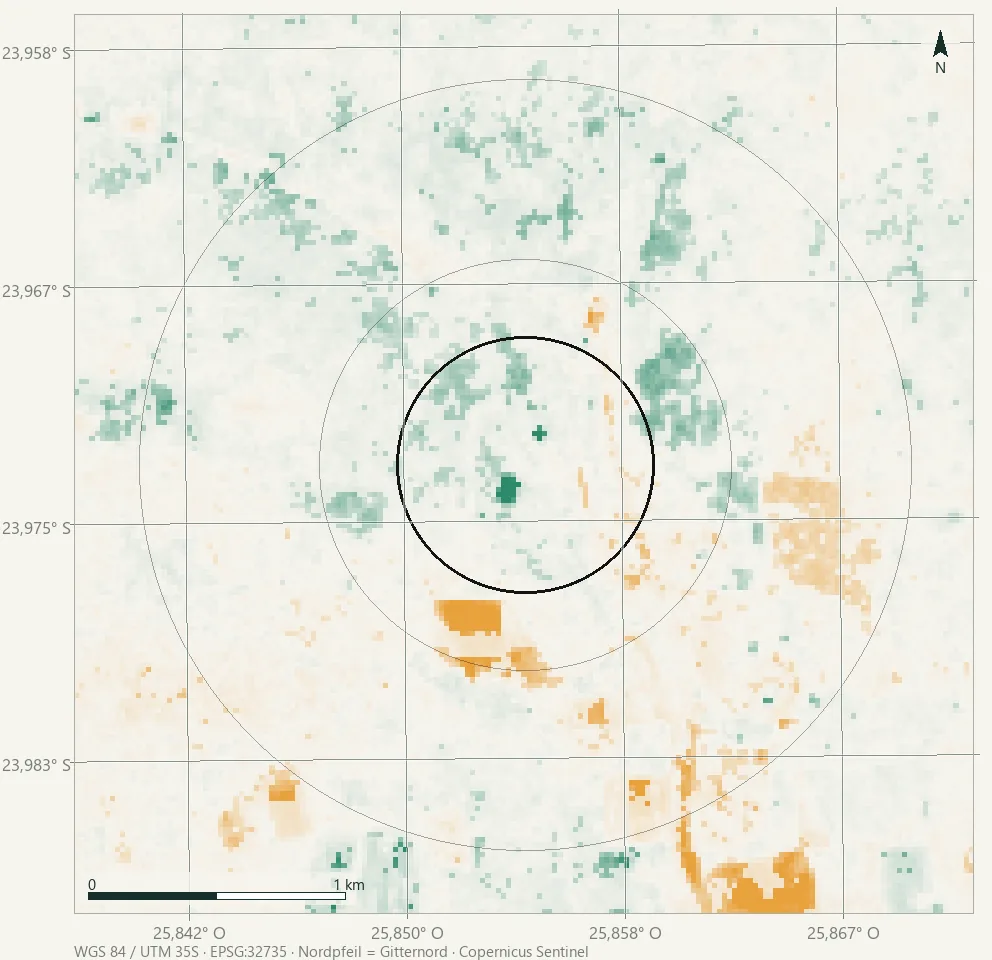
Same calculation, different lens: water in the leaf
- Strong colour: the direction is supported by the data (p < 0.05).
- Pale colour: a direction is there, but it cannot be supported.
Both lenses show the same direction, but with different strength. In green the core rises by 0.0034 points per year and the ring by 0.0005, which is seven times as much. In water the core rises by 0.0025 and the ring by 0.0010, only two and a half times as much. The core's lead is therefore distinctly larger in colour than in leaf moisture.
The density of supported pixels drops as well: in green 25.8 per cent of the core pixels carry a supported trend, in water 16.3. That is the more honest figure, not a contradiction: the NDMI sits closer to the noise floor because at 20 metres it comes from two narrower bands.
What does that mean? The area turns green faster than it turns moist. More leaf mass, then, without correspondingly more water in the leaf. That fits emerging grass and low woody growth, and it fits a shift in species composition just as well, and from above the two look the same. Here the second lens does not sharpen the answer but the question: it rules out that the core has simply become wetter.
In the Ammerland the same check came out the other way round: there the NDVI did not find the drought summer of 2022 at all, while the NDMI showed it clearly. That colour shows more than water here is therefore itself a finding, not a matter of course.
The same area is available as a scene in the layer explorer, the first one outside Germany. There every national layer falls away: no state aerial imagery, no field blocks, no soil map, not even a base map. What remains is Copernicus. (The tools are in German.)
See for yourself
Open the area of this instalment as a scene in the scene explorer · look up the source and licence of every layer in the connector catalogue.
Context What the numbers do not say
A gain of 0.003 a year is small. It only stands out because it appears as a connected patch and because the surroundings do not show it. Why, it does not say: from this height a cattle post, a borehole, an abandoned parcel, an old burn and a fence all look the same.
As for the hunch at the beginning: a fenced area recovering would look roughly like this. That is not a confirmation. It only means the data do not contradict the story, and that difference is the whole point. An area that nobody farms any more fits just as well.
0 m The first step
What this is aboutthe difference between a finding and a story.
What stands in the waythat an image taken from 786 kilometres up always looks like an explanation.
The first stepsend the finding to the people who live there, and ask what they see when they look.
In Oldenburg the next step is called: go there. Here I cannot. But I can sharpen the question until it can be answered on the ground in five minutes: Is there a fence? Since when? And who decided that it should stand there?
With that the site visit is prepared, only not by me. Anyone in the area, someone from Kweneng, someone on the way to Gaborone, someone from a university in Gaborone, needs a quarter of an hour and a photograph. The coordinate is at the top. If you go: I will publish the report, with your name on it, next to this calculation.
What stays open from a distance
The fence. Whether it exists and when it was put up is in none of these datasets. A fence is narrower than a pixel.
The use. Who owns the land, who grazes it, whether there is a well: that is known by the people who live there.
The time before. Sentinel-2 reaches back to 2017. Ten years is not much: a pixel has to run fairly stubbornly in one direction before I can support its direction. Weaker changes go unnoticed. “No trend” here means “not demonstrable”, not “not present”.
What remains is an area that is poorer than everything around it and catching up regardless, and nobody here knows why. Perhaps someone there decided what is allowed to happen. Perhaps someone simply stopped deciding. How many such places are there, do you think, where nobody ever looks?
The recurring procedures, median composite with cloud mask, core-ring comparison, sign test, Theil-Sen slope with Mann-Kendall test, permutation test, are explained on the methods page: what each does, why we chose it, what it cannot do. Here are the parameters of this instalment; scripts and data files are versioned on GitHub: github.com/retteten/fieldbook-code.
- Area and grid: centre −23.973037 / 25.854650, Kweneng District, Botswana. The computation is metric, in WGS 84 / UTM 35S (EPSG:32735); analysis grid 20 metres, every cell exactly 400 m², the illustrative images 10 metres. Core: circle of 500 metre radius (78.5 ha, 1,966 pixels). Control ring: 800 to 1,500 metres (505.8 ha, 12,642 pixels). Core and ring are evaluated, not the whole view; pixels with fewer than two cloud-free observations are left out.
- Data and window: Sentinel-2 L2A via the Copernicus Data Space Ecosystem; per rainy season the cloud-cleaned median from 15 December to 15 March, years 2017 to 2026. The year names the rainy season that begins in the December before. Contains modified Copernicus Sentinel data 2017–2026.
- Seasonal window measured, not assumed: monthly composites over three cycles (July to June) put the green peak in January (in the weak rainy season 2023/24: May), the trough in September/October, amplitude 0.17 to 0.30 NDVI points. The original window, 1 February to 15 April, caught only 69 to 88 percent of that depending on the year, and was discarded.
- Observation density: cloud-free scenes per pixel and rainy season, across all ten years and the whole view: at least 5, median 18, at most 26.
- State: median NDVI in the core minus median NDVI in the ring, per year; mean difference −0.0313 (range −0.0624 to +0.0094). Exact sign test over the ten annual differences: 9 of 10 negative, p = 0.021.
- Drift of the mean: line through the ten averaged annual differences, checked by permutation test (20,000 rearrangements): slope +0.00301 per year, p = 0.209, not demonstrable; the text above says so as well.
- Change per pixel: per year the deviation from the ring median, then Theil-Sen slope and Mann-Kendall test (two-sided, α = 0.05, at least eight usable years). Core: median +0.00335 per year; 417 pixels with a supported increase, 90 with a decrease, 25.8 percent with a trend. Ring: +0.00047 per year; 1,112 to 762, 14.8 percent. The test runs over the years, not over the pixels: neighbouring pixels are too similar to each other to count as separate observations. The shares are pixel counts without a formal error estimate.
- Second lens (NDMI): the same chain, the same
acquisitions, the same cloud mask. A three-band request delivers
NDVI and NDMI together (the Processing API bills input bands, not
output ones; the band factor rises from 3/3 to 5/3 instead of paying
for the orbit samples a second time).
NDMI = (B8A − B11)/(B8A + B11), 20 metres.
Core: median +0.00246 per year; 280 pixels with a supported increase,
40 with a decrease, 16.3 per cent with a trend. Ring: +0.00101
per year; 758 to 600, 10.7 per cent. Call:
python scripts/ndvi/punkttrend.py --lat -23.973037 --lon 25.854650 --name botswana --index ndmi· data:punkttrend-botswana-ndmi.json. - Method sources: Theil-Sen slope after Sen (1968), doi:10.1080/01621459.1968.10480934; trend test after Mann (1945), doi:10.2307/1907187, and Kendall (1975), Rank Correlation Methods, 4th edition; an openly accessible practical account in Helsel et al. (2020), Statistical Methods in Water Resources, USGS TM 4-A3, ch. 12, doi:10.3133/tm4a3. Why this pair and not a regression line: the median of all pairwise slopes does not collapse when a single rainy season is an outlier, and Mann-Kendall requires no normal distribution. The price is low test power with ten values, which is why the area rule carries the evidential weight here, not the individual pixel.
- Map frame (recipe R5): every map carries a graticule,
scale bar, north arrow and CRS stamp inside the image itself
(
scripts/ortstermin/kartenrahmen.py). The graticule lines are true geographic lines, projected into the analysis CRS at 33 support points. The north arrow points to grid north; where this differs from geographic north by more than half a degree, the meridian convergence is given in the footer. Added on 15 August 2026; the previously published maps of this instalment carried no frame. - No test for break points: a step in the series appears in this calculation as a shallow trend. It therefore says nothing about when a change began.
- Map record: Sentinel-2 L2A via the CDSE Processing
API · raw data retrieved and processed on 12 August 2026 ·
calls:
python scripts/ndvi/saisonprobe.py --lat -23.973037 --lon 25.854650 --name botswana --zyklen 2022 2024 2026·python scripts/ndvi/punktauswertung.py --lat -23.973037 --lon 25.854650 --name botswana·python scripts/ndvi/punkttrend.py --lat -23.973037 --lon 25.854650 --name botswana· data:saisonprobe-botswana.json,punktauswertung-botswana.json,punkttrend-botswana.json(in the repository underdocs/daten/). The overview image (true colour, 10 m,scripts/ndvi/punktbilder.py) and the trend map (20 m, frompunkttrend.py) come out of the same runs. - Location: Kweneng District, Botswana. Reverse geocoding via Nominatim, © OpenStreetMap contributors, https://www.openstreetmap.org/copyright, data under ODbL. A place search in the vicinity returns no named place; that is the state of the mapping, not a statement about the area.
- Elevation 1,057 to 1,110 metres according to Copernicus DEM GLO-30, queried August 2026. Contains modified Copernicus data (2026).
- The hunch that stood at the beginning, fenced off and green afterwards, comes from a conversation and not from a source. It is explicitly carried here as unverified.
- For every number here the long version is open in the data files on GitHub: annual values one by one, test results, and the literal call that produced them. If you need anything beyond that, a message is enough.